


This tutorial will show you how to use Photoshop Filters to create a basic paint outliner effect. It is a very simple effect, but it looks realistic and has good detailing without the use of textures or brushes.

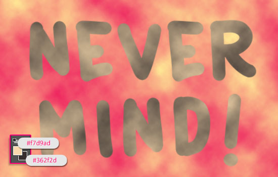
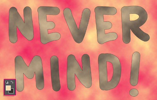
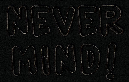
The Final Result:

Notes:
* the software used in this tutorial is Adobe Photoshop CS6, but you can use CS3+ versions as well.
* you might want to check the Basix Page to see some useful topics on dealing with Photoshop basics, such as loading palettes and some shortcuts.
* you might want to check the Basix Page to see some useful topics on dealing with Photoshop basics, such as loading palettes and some shortcuts.
Resources:
* Catatan Perjalanan font.
Step 1
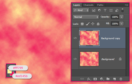
- Create a new 1152 x 864 px document. Set the Foreground color to #fff799, and the Background color to #ed145b. Then go to Filter -> Render -> Clouds, and duplicate the Background layer.
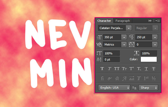
- Create the text in White using the font Catatan Perjalanan. The font Size is 350 pt, and if you’re creating more than one line of text, set the Leading value to 250.
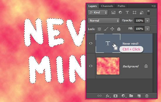
- Ctrl/Cmd + click the text layer’s thumbnail to create a selection.
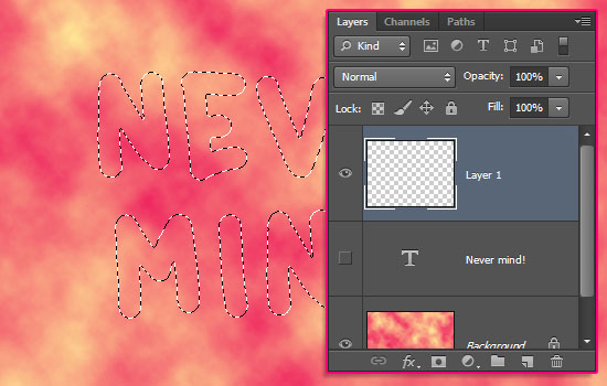
- Make the text layer invisible by clicking the eye icon next to it, then create a new layer.
- Set the Foreground color to #f7d9ad and the Background color to #362f2d, then go to Filter -> Render -> Clouds.
Get rid of the selection by going to Select -> Deselect.
You might think this is one random selection of colors, but it is a result of trying a couple of other values to get the needed contrast for the best final result.
Step 2
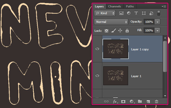
- Select the clouds text layer (Layer 1) and the Background copy layers, then go to Layer -> Merge Layers.
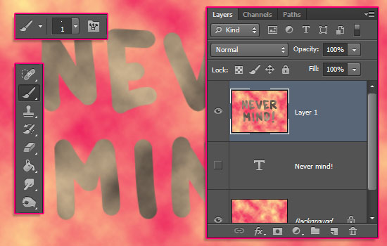
Pick the Brush Tool and choose a 1 px hard round brush tip.
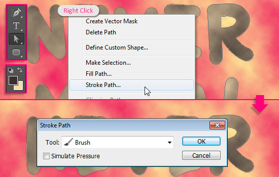
- Right click the original (invisible) text layer and choose Create Work Path.
- Click the little ‘Switch Foreground and Background Colors’ arrow on top of the Foreground/Background color boxes, so that the darker brown is the Foreground color.
Select the merged layer once again, pick the Direct Selection Tool, right click the work path, and choose Stroke Path.
Then, choose Brush from the Tool drop down menu, with the Simulate Pressure box un-checked.
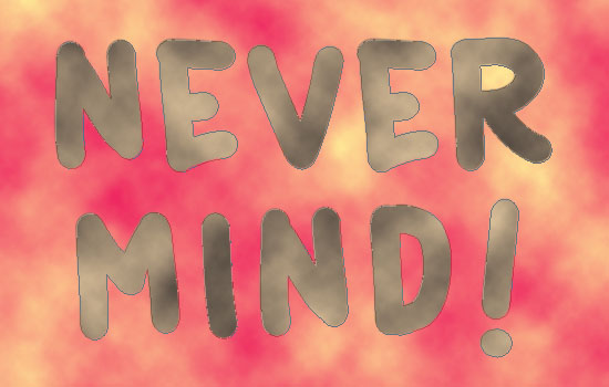
- Hit Enter/Return to get rid of the work path.
Click the ‘Switch Foreground and Background Colors’ arrow once again to switch the colors back. This is important for working with the filters next.
Step 3
Now, for the fun part: The Filters!
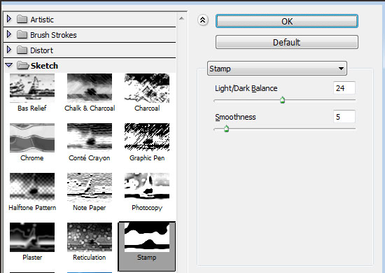
Change the settings of each filter as shown in the accompanying screenshot.
- Start by going to Filter -> (Filter Gallery) -> Sketch -> Stamp.
You might need to use a smaller Light/Dark Balance value if you’re getting way too much details, or a bigger one if the outlines of the letters are missing some parts.
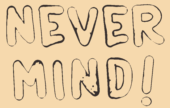
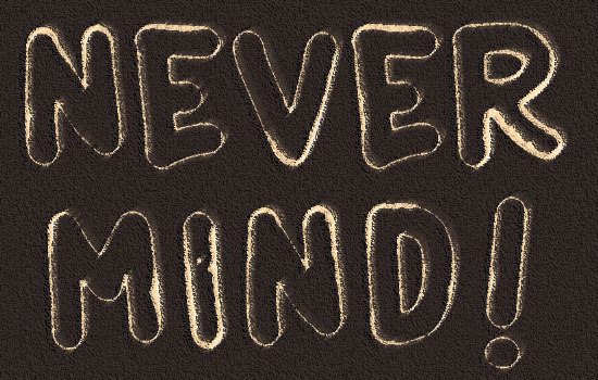
- This is what you should get. Duplicate the layer you have.
Note: If you do not switch the Foreground/Background colors, you’ll get an inverted version. This is a nice effect that you can use as well 
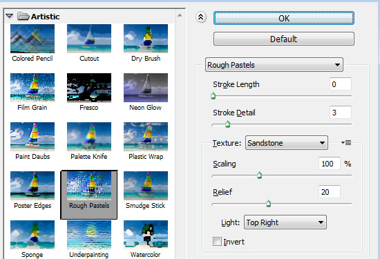
- Now for the duplicated layer, go to Filter -> (Filter Gallery) -> Artistic -> Rough Pastels.
- This will add some more details.
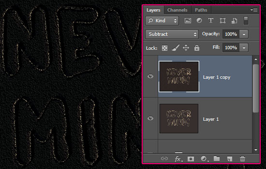
- Change the duplicated layer’s Blend Mode to Subtract.
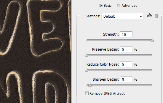
- Go to Filter -> Noise -> Reduce Noise.
- This will reduce the previous filters’ noise, and make the outline more smooth looking.
Step 4
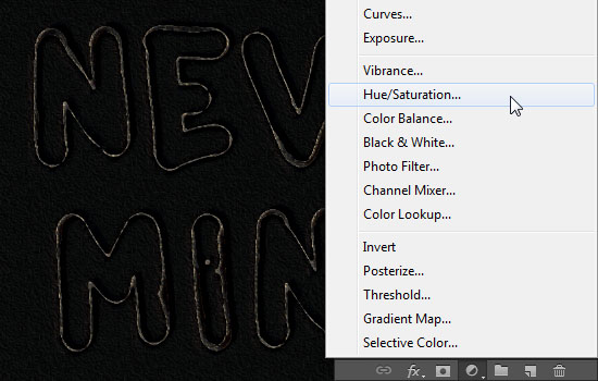
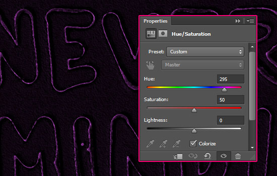
- Click the ‘Create new fill or adjustment layer’ icon own the Layers panel and choose Hue/Saturation.
- Check the Colorize box, change the Saturation value to 50, then start moving the Hue slider to get the different colors you can use for your final outcome.
The color used here is a purple one with the Hue value of 295.
You can definitely play some more with the coloring and brightness of the final result, but this is it for the tutorial.
Hope you enjoyed it and found it helpful!


